The Silver Screen.
I never quite knew what the term “silver screen” actually meant until I began researching for this collection. It points to an era in early film history when projection screens were coated with reflective metallic paint, leaving them with a silver surface which would better display the movies cast upon them.
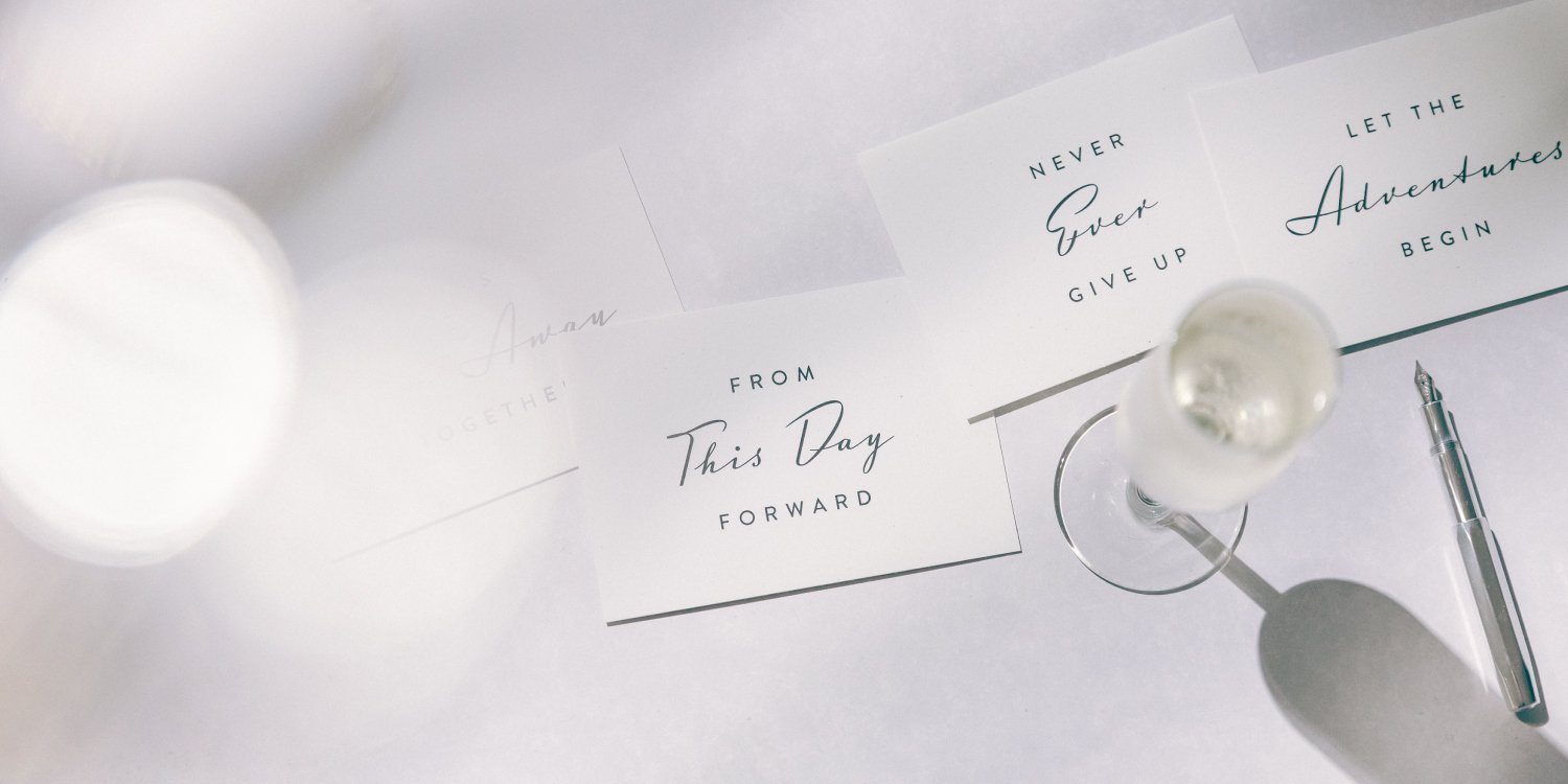
The aesthetic surrounding that time seems much more glamorous than just that. This super simple typographic style of this collection takes it’s visual cues from “The End” titles of Hollywood movies of yesteryear, but think elegant starlets and brooding leading men, sun soaked backlots and vintage convertibles and you have the real inspiration for these pieces
Personality:
Elegant, confident, expressive, classic, dramatic, stylish, timeless.
Colours:
Greys and silvers. If it could appear in Roman Holiday then it’s good for this collection.
Geographic origin:
Where else but Hollywood?
Design notes.
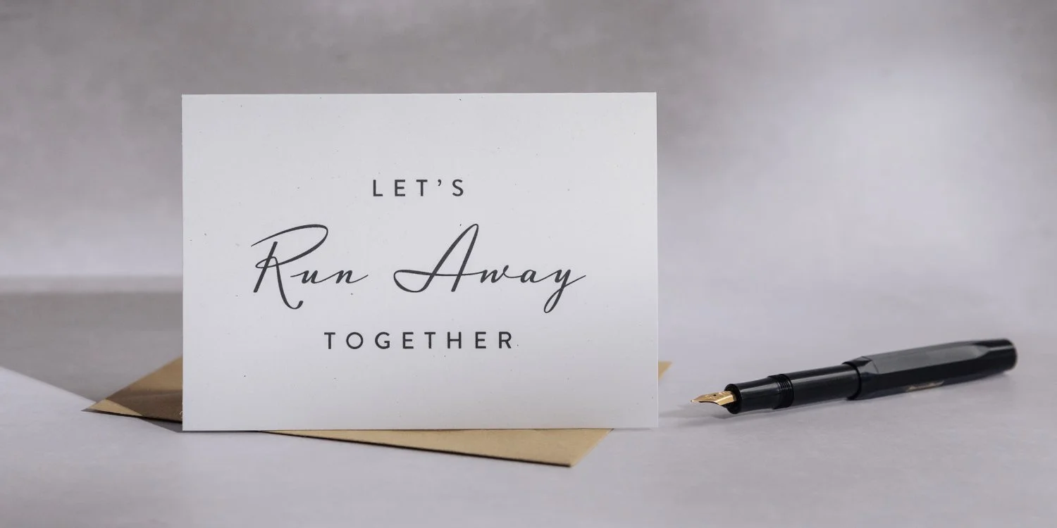
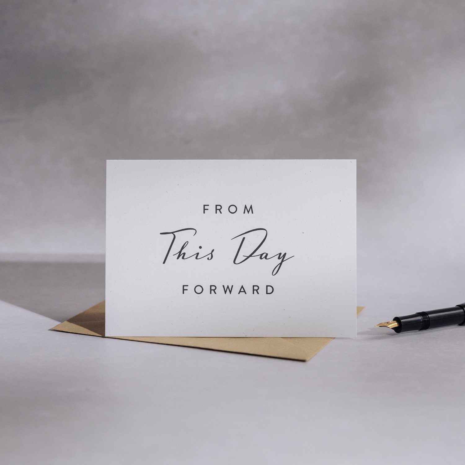
Our standard house off-white card stock and brown ribbed envelopes for the core collection presents an elegant and timeless.
The type is the thing here and the personality of a larger than life script paired with a stocky sans serif feels perfectly reminiscent of star and agent.
Flat printed with vegetable based inks / Mohawk Loop Snow 100% recycled paper stock / Eco-craft 100% recycled stock brown ribbed envelopes
“Hollywood isn't a place, it's a way of life.”
- Helene Hanff -
Shop The Silver Screen collection.
Personalise and Customise goods coming soon.
Sign up to receive Notes from the Studio to be the first to hear of new releases.


